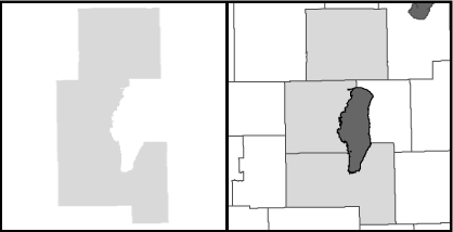
This is an example of figure ground! This is an example of figure ground! This is an example of figure ground! This is an example of figure ground! This is an example of figure ground!
Successful map design relies on a host of factors, a group of which are common to graphic design disciplines in general. And one of the most basic concepts in this regard goes by the name of the "figure-ground relationship."
Whether you are designing an advertisement, a statistical graph, a web page of family photographs, a television studio set, or a map, you need to pay attention to how the key graphic components of your design (the "figure")contrast visually with their surroundings (the "ground").
In maps, the usual concern with figure-ground is to achieve an effect where the graphic element of importance (let’s say, the state of Wisconsin) appears to float above the surrounding area.
There are a number of techniques you can employ, the most common being simply to make the surrounding area somewhat darker. The opposite approach–making the figure darker than the ground–sometimes works as well. A shadow effect can be helpful as can differences in hue. Take a look at a selection of maps and judge how figure-ground has been approached.
In a map, figure-ground also needs to considered for smaller elements such a blocks of text, legends, etc. A technique may not be required depending on how prominent these elements need to be for your maps’s message to get through.
Figure-ground is just one of the dozens of topics that our office covers in our one-day Map Design Workshop. Keep an eye on our website for news of the next date it will be offered, or let us know if you’d like to be informed.
Study, learn, succeed
Once you begin to study figure-ground effects, you will be on your way to noticing what works and what doesn’t. Of course, mastering the figure-ground relationship isn’t always simple since there are many other competing considerations involved in a map and each map presents a different challenge. Nevertheless, your goal should be able to establish a solid figure-ground effect in every map.
Without this fundamental factor in place, you run the risk of making your map difficult to decipher. Take a look at print advertising and you’ll quickly notice how the graphic designer has dealt with figure-ground. Poor figure-ground would confuse a potential customer and likely reduce sales.
Even the experts can fail
The other night I saw a TV wrap-up show following the day’s matches at the French Open tennis tournament. The network had decided to use an outdoor set with the almost dark evening sky of Paris in the background. Very chic. Unfortunately, one of the commentators was wearing a very dark blazer and had dark hair. The result was that her presence on the screen was limited to her face and hands since it was impossible to tell where her shoulders or hair ended and the night sky began. Whoops…no figure-ground!
